Color Psychology in Branding 12 Popular Colors and 5 Tips for Choosing the Right One - Part I
If you want to leverage the power of color psychology for your brand, this article is just what you need.
Color psychology is an effective tool for creating vibrant and unique brand experiences. Also, it pertains to the emotions and feelings that brands evoke in us.
Coca-Cola is a great example. Its signature red is forever associated with positivity, fun, and energy. Similarly, IBM's classic blue instantly conveys trust and security, reflecting the company's long-standing presence in the business-to-business sector.
This article will cover everything you need to know about color psychology, including its definition, significance for your brand, and the proven psychological effects of 12 of the most popular colors in marketing.
What is Color Psychology?
Color psychology is a research field that examines how colors influence our world perception. Colors significantly affect our emotions and feelings, which influence our behavior as consumers.
Color psychology offers a framework for understanding our interactions with brands and why certain colors resonate with us more than others. It is powerful to craft memorable and impactful brand experiences, as colors can leave a lasting impression in customers' minds.
Research has shown that the strategic use of colors can increase brand recognition by up to 80%, highlighting the critical role of color psychology in marketing and design.
How Color Psychology Impacts Your Brand?
Grasping color psychology in branding equips you with an essential tool to achieve the primary branding objective: shaping perceptions that guide consumer behavior.
Our emotions directly impact our behavior. As this article clarifies, color is one of the most powerful and reliable ways to evoke specific emotions in your target audience. It can significantly impact their purchasing decisions related to your brand.
Research indicates that 85% of consumers consider color a key factor for choosing a brand over another.
This illustrates the profound impact that color psychology can—and should—have on your brand. It should inform every aspect of your branding, from logo selection and design to the overall brand experience across various channels and touchpoints.
While individual reactions to colors may vary based on factors such as gender, cultural background, personal experiences, and neurological differences, numerous studies have established general guidelines regarding color psychology in marketing.
You may already know that red can evoke romance or danger, while blue can inspire calmness or serenity.
But what about less common brand colors like orange or gray? And what about less obvious emotions like harmony or hope? Which colors evoke these feelings in your customers?
Since color is a fundamental visual stimulus in human perception, these questions are vital for conveying the narrative you wish to share with your target audience.
Exploring the color psychology in branding and marketing is an excellent way to find answers.
The Psychology of 12 Popular Colors
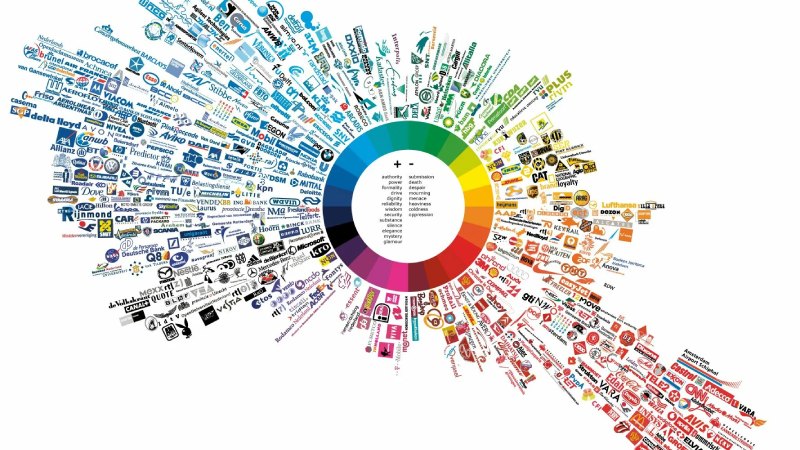
Color psychology offers many advantages when integrated into branding and marketing strategies. Observing the color choices of leading global brands can illustrate the significant impact that color psychology can have.
So, what are the psychological meanings associated with the most frequently used colors in branding and marketing?
Below is a list of 12 colors commonly employed in these fields, with insights from color psychology for each.
Remember, there are no fixed emotional responses to any color. Context and culture are important in color psychology within branding.
Depending on how it is used, a single color can evoke two entirely different emotions. For example, green can symbolize both health and illness.
Therefore, understanding your brand's position and identity allows you to rationally choose the right color.

1. Red Psychology
Red is an extremely powerful color emotionally, and its effects are clear and undeniable. Therefore, it is vital to use it judiciously in branding. Many global brands have effectively incorporated red into their marketing, but moderation is key.
Red reduces analytical thinking, as it accelerates and amplifies our reactions., making it perfect for advertisements. This is why red is often seen on discount tags; its wavelength makes it appear closer than it actually is.
Research indicates that athletes competing against opponents in red are more likely to lose, and students exposed to red before tests often perform worse. Red is used in stop signs, grammatical errors, and financial problems.
Positive Associations
- Energy.
- Passion.
- Activity.
- Courage.
- Strength.
- Excitement.
Negative Associations
- Anger
- Danger
- Warning
- Rebellion
- Aggression
- Pain
2. Orange Psychology
Nestled between red and yellow, orange is an energizing color that evokes excitement, enthusiasm, and warmth. Its lively nature makes it a popular choice among many sports team brands.
Like red and yellow, orange is often used to attract attention, which is evident in items such as traffic cones and website buttons. Studies reveal that consumers often associate orange with value, a fact that many brands have capitalized on.
Orange evokes comfort like food, warmth, and shelter. It’s the color of sunsets, citrus fruits, and pumpkins and is often linked with autumn. This association becomes even more pronounced when combined with black, resulting in a blend of light-heartedness and a hint of horror.
Positive Associations
- Courage.
- Confidence.
- Warmth.
- Innovation.
- Friendliness.
- Energy.
Negative Associations
- Deprivation.
- Frustration.
- Mischief.
- Immaturity.
- Ignorance.
- Laziness.
3. Yellow Psychology
Although yellow isn't a top choice in marketing colors, it has a dedicated following. Often seen as a bright and cheerful hue, yellow can also trigger negative emotions if overused.
For many, yellow can induce nausea, which is one reason it's rarely found on cruise ships. This is because of its challenging visual processing, with some studies suggesting it can even make infants cry.
On a positive note, research shows that yellow may boost metabolism and confidence when applied strategically. Its relatively long wavelength makes it the most visible color, capturing attention and stimulating the senses. Consequently, it is commonly used in traffic signals, advertisements, and warning signs.
Positive Associations
- Optimism.
- Warmth.
- Happiness.
- Creativity.
- Thought.
- Extroversion.
Negative Associations
- Irrationality.
- Fear.
- Caution.
- Anxiety.
- Frustration.
- Cowardice.
4. Green Psychology
Green is gentle on the eyes since it requires no adjustment upon reaching the retina, making it a soothing and pleasant color. This calming effect is why performers often relax in green rooms before taking the stage or appearing on television.
Green enhances vision and is used in night vision technology because our eyes can detect the most shades of this color; it represents balance. In branding, green is associated with nature and fertility.
The green world is perceived as a safe realm full of greenery, water, and life. However, like all colors, green also has a negative side, symbolizing health and illness, luck and envy.
Positive Associations
- Health.
- Hope.
- Freshness.
- Nature.
- Growth.
- Prosperity.
Negative Associations
- Boredom.
- Stagnation.
- Envy.
- Apathy.
- Weakness.
- Illness.
5. Turquoise Psychology
Turquoise is an intermediate color between blue and green, combining the serenity of blue with the natural qualities of green. It evokes clarity of thought and communication, making it an inspiring choice in marketing. Turquoise is associated with refreshing the spirit, renewing energy levels, and stimulating positive thinking.
It invites creativity and self-expression, which is why it’s often seen in brands related to communication in education, media, and technology. Additionally, turquoise is an excellent color for cleaning products, conveying cleanliness and purity.
However, in inappropriate contexts, turquoise can suggest indecision or lack of thoughtfulness; using it in situations that demand decisive action may create an impression of unreliability or hesitation.
Positive Associations
- Communication.
- Clarity.
- Calmness.
- Inspiration.
- Self-expression.
- Healing.
Negative Associations
- Arrogance.
- Secrecy.
- Unreliability.
- Reserve.
- Hesitation.
- Isolation.
6. Blue Psychology
While red represents physicality, blue engages the mind. It is a calming and soothing color that evokes clarity and communication. It is the most favored color globally, particularly among men.
Blue is present in our everyday lives—from clear skies to bodies of water—and its prevalence contributes to its perception as a peaceful, conservative, and traditional hue. Many brands consider it a safe option; over 33% incorporate blue as their primary color.
Blue evokes trust and security, which is why it is commonly found across financial sectors, including banks and private equity firms. Research indicates that productivity increases in blue environments.
However, blue can also symbolize sadness and coldness, making it less common among food brands. It’s one of the least appetizing colors, often associated with spoilage and toxicity. Therefore, weight loss plans suggest using blue plates.
Positive Associations
- Trust.
- Loyalty.
- Reliability.
- Logic.
- Calmness.
- Security.
Negative Associations
- Coldness.
- Isolation.
- Lack of emotion.
- Austerity.
- Indifference.
- Loss of appetite.
In Conclusion
This part of the article discussed the definition of color psychology and its impact on branding while delving into the psychology behind 6 specific colors. Part II will continue discussing the remaining colors and provide 5 tips for choosing the right color for your brand.